Creating A Responsive Navigation Bar Using HTML, CSS and JavaScript
Introduction
Hey geeks, welcome to today's exciting post where we'll explore the process of creating a responsive and stylish navigation bar using HTML, CSS, and JavaScript. As a fellow beginner developer, I understand the challenges we face when it comes to designing a navigation bar that stands out. That's why I'm thrilled to share my current navigation bar script with you. In my GitHub Repository, you'll find all the source codes you need, and there's even a live demo available for you to explore and play with!
Why a Responsive Navigation Bar?
A responsive navigation bar is essential for modern websites and portfolios. It ensures that your site remains user-friendly and accessible across a wide range of devices, including desktops, tablets, and smartphones. By adapting to different screen sizes, a responsive navigation bar guarantees a seamless browsing experience for your visitors, regardless of the device they're using.
Building the Nav Bar
Now, let's dive into the exciting process of building our responsive and stylish navigation bar. We'll harness the power of HTML, CSS, and JavaScript to bring our design to life and add some interactive elements to make it even more engaging and fun.
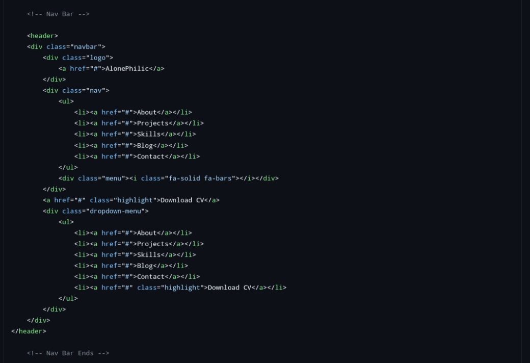
HTML Structure
The first step is to structure our navigation bar using HTML. This involves creating the necessary elements, such as the navigation container, the menu items, and any additional components you want to include. Here's an example of how you can organize the elements:
CSS Styling
Next, we'll apply CSS styles to transform our navigation bar into a visually appealing and stylish element. We'll define the positioning, colors, fonts, and other visual aspects to match your desired aesthetic. Feel free to get creative and add your personal touch to make it unique. Here's a sneak peek at the CSS styling:

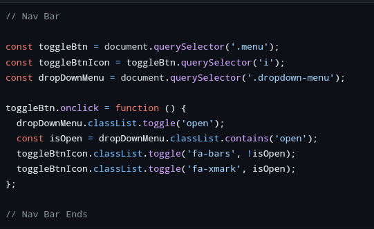
JavaScript Functionality
To take our navigation bar to the next level, we'll incorporate some interactive functionality using JavaScript. This will make the navigation bar more engaging and fun for your visitors. We'll implement features such as a toggle menu button for smaller screens, smooth scrolling to anchor points within the page, and dynamic highlighting of the active section in the navigation bar. Check out the JavaScript functionality:
Conclusion
Congratulations on creating your own responsive and stylish navigation bar! By combining the power of HTML, CSS, and JavaScript, you've successfully built a crucial component that enhances user experience and accessibility. Remember, all the source codes for this project are available in my GitHub Repository, and don't forget to explore the live demo to see it in action.
That wraps up our blog post for today! I hope you found this tutorial helpful and that it inspired you to create unique and eye-catching navigation bars for your projects. If you have any questions or need assistance, please don't hesitate to reach out. Happy coding and have fun customizing your navigation bar!